REV23 App Spotlight: Customer Profile
We are so excited to start sharing some screenshots and details about design choices of the UX (user experience) with you of our upcoming mobile app! Let’s start with the customer profile!
In the majority of cases, customer data will be entered by the customer themselves, in a mode called Kiosk Mode (which will get a blog post later). This is a special mode of the app where they will fill out the release form. They are contained to this area until it is unlocked by an authorized user.
However, the Customer profile screen, which is visible to authorized users of the app, is one of the central and most important views, providing details of the client you’re about to work on.
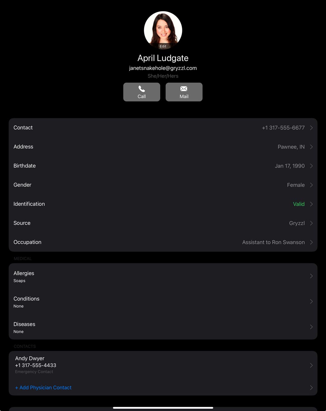
Originally for this screen, we started with a very complex layout like what you’d find in REV23 Desktop or a form you fill out on a website. Many text boxes and fields, organized, of course, but still a bit bleh. While this works great in Desktop, it just didn’t feel right or natural to use on this type of device.
While searching for apps like REV23 to inpire us by how they deal with this much data collection, we were kind of left empty handed. As it turns out, there aren’t many apps similar to what we were trying to accomplish, and of those that do exist, I didn’t feel they had the best user experience either.
Eventually we scrapped the entire screen and built it from scratch, using the iOS Settings app of all things as a reference! I found the Settings app to be well organized, easy to locate things, and at the same time shows you all necessary information at a glance. Actually, this UX ended up being adopted in a few other areas as well. There are some areas where it is not yet implemented, but will be soon after release in smaller updates.
Let’s start at the top! We have a profile picture (optionally taken by the client during Kiosk Mode, or added later by you), and easy access to contact information, as well as the ability to quickly call or email. Additionally, if the client does have a preferred pronoun, it will be shown to you here. If no profile picture exists you will see the traditional "initials circle" with a colored circle with the client initials. Additionally, clients under 18 are not prompted to take a picture, nor can one be added manually.

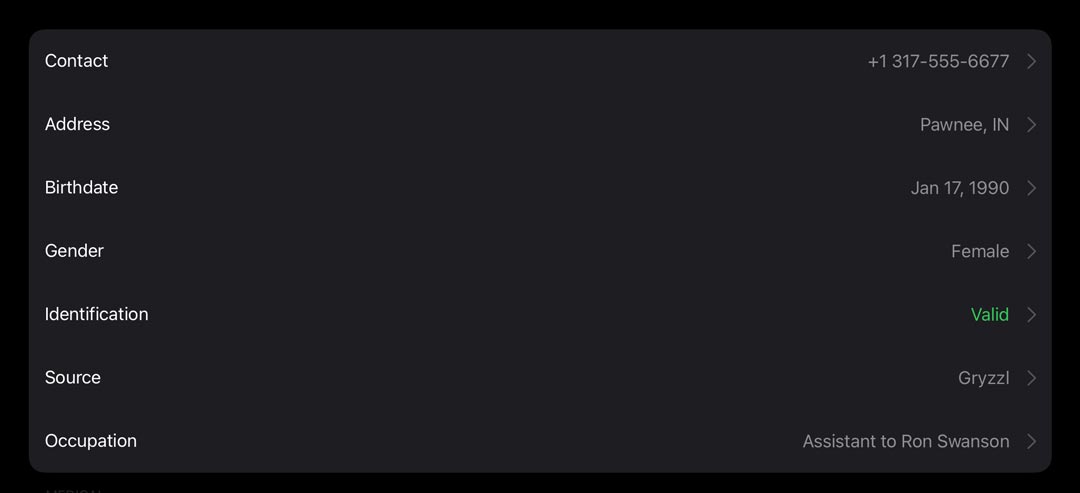
Next we have a group containing their profile information. While we display the most important pieces of data from each group, for example, the city and state which they reside in in the address row, you can tap that row to see the rest of the details, as well as make edits. So by default, nothing in this screen is directly editable, you must tap into one of those rows to begin making changes. This prevents accidental data changes or deletion. Additionally, it keeps you very focused on what you want to change, rather than scanning and scrolling the screen looking for that one field.
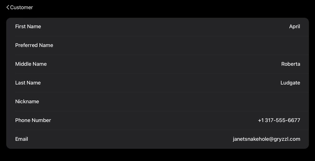
One big change from REV23 Desktop design and this app design is how data is saved. We have eliminated the Save/Save & Close buttons from most views (they still exist in a few areas) and data is saved when you make a change and navigate away. In the screenshot below you will see the < back button in the upper left. When that is tapped, the customer fields in that view will be updated automatically. In some cases, there is a specific Save or Done command that will trigger that update, but in other spots we tried to keep this as fluid as possible.
One thing to note about the Identification row is the green Valid status in the screenshot. This indicates that the ID exists and is not expired. If data is missing or the ID needs to be updated, this will show a red Invalid message.
Moving down we have their medical information. Again, this information is critical to see at a glance, such as latex or soap allergies, etc… any allergies, conditions or diseases they have selected will be visible to you here for easy access. This section is also protected by security, so only the users required to see a customer’s medical information are permitted to do so.
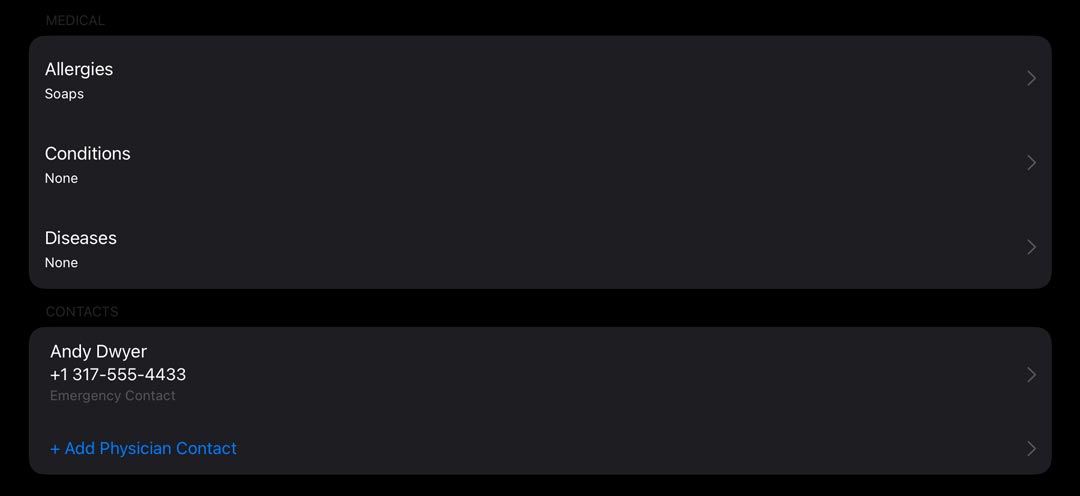
We also have easy access to the client’s emergency and physician contacts. This is becoming required by more and more health departments, so making this easy to see (in an emergency situation) and verify its presence is important.
Additionally, there is access to notes, file attachments, and a list of their past services.
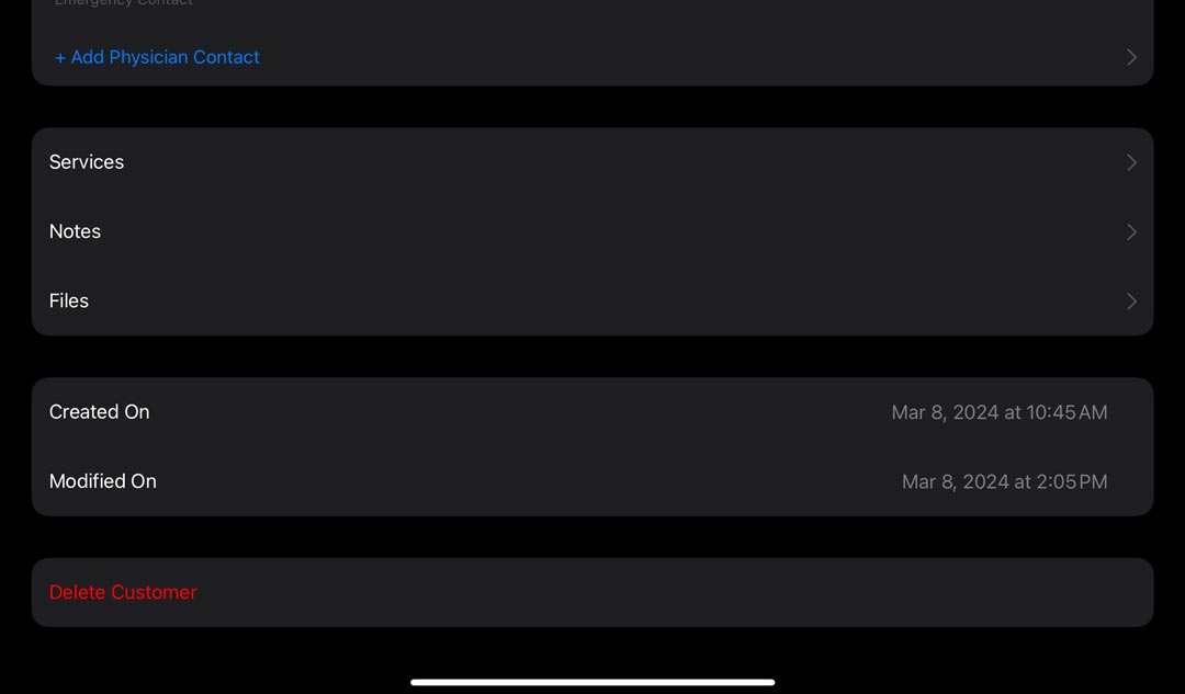
What are your thoughts on this screen? Do you think we hit the mark? We will be sharing some additional screenshots over the next few weeks as we are getting very close to launch!
3 Comments
Nate Laff
Thanks for reading! What do you think about the screen? I am happy with how this turned out and became the foundation for other areas in the user interface. I am excited to share more with you this month.

Andrew Wale
Is this an app that the customer downloads or is this something that we would install on a tablet? Just curious. Speaking of tablets, will this be something that we can use on our own tablets (I'm assuming) or will this be something that we will need to figure out like the signature pad or the Credit Card receiver?
Nate Laff
Hi Andrew! No, your clients do not install this. It is intended to be installed on shop or artist iPads only.
Clients will be able to fill out release forms from a public endpoint on the website though.
Add Comment
You must be signed in to comment. Log in to join the conversation!
